What is a Platform Admin?
Product Modules: select your Ziik tools
How to brand your app
How to customise your homescreen
🛡️What is a Platform Admin?
A Site Admin is a Ziik user with access to the Admin Panel, giving them control over your Ziik environment, including:
-
Activating or deactivating Product Modules
- The visual Branding of your platform
-
Global settings (e.g., Default language)
-
Configuring Roles, Integrations, and Billing
Here's a full guide to the admin panel including how to add other platform admins. For now, let's focus on modules and branding 👉
📦 Product Modules: select your Ziik tools
- Ziik is modular, meaning you can choose which tools your organisation needs, and which ones to disable.
- Modules appear in the interface only when activated
- Each module unlocks specific role permissions such as "Can create Groups", or "Can view statistics"
The modules offer solutions for:
Communication
News, Chat, Groups, and Events
Information
Handbooks, Files, Shortcuts, and FAQs
Operations
Checklists, Personal Documents, Schedule
Security
Two-factor Authentication
Statistics
Activity and usage statistics
💡Tip: You can always activate more modules at a later stage - begin by activating the tools that are most useful to your organisation
⚙️ How to activate & deactivate modules
Permission required: Only Platform Admins can access the branding settings
-
From Ziik's web application, click the cogwheel icon in the top-right corner
-
Select Modules
-
Turn modules on/off
- Turning on adds the module to the platform interface instantly
-
Turning off hides the module from the interface, but preserves all existing data in it
🎨 Branding & Homescreen editor
Use the Home Screen Editor to design the first thing your users see when they open Ziik - from the header and splash screen to the tiles on your home screen.
Go to Branding in the Admin panel. You need Admin permissions to access this area. The editor is split across five tabs: Top, Bottom, Splash, Home, and Icons & menu names.
Permission required: Only Platform Admins can access the branding settings
1. Open the Admin Panel by clicking the cogwheel in the top right corner of the web app
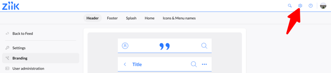
2. Click Branding
Header
The Header tab controls the bar at the top of the app — the one that contains your logo, the search icon, and your profile icon.
You can configure:
- Background — the background colour of the header bar
- Icons — the colour of icons in the header
- Text — the colour of any text in the header
- Border — the colour of the bottom border of the header
- Logo (mobile) — your logo as displayed on mobile; will be cropped if the aspect ratio exceeds 4:1
- Logo (desktop) — your logo as displayed on desktop; will be cropped if the aspect ratio exceeds 8:1
Use the colour pickers to enter hex values directly or select from the palette. Changes are reflected immediately in the preview.

Footer
The Footer tab controls the navigation bar at the bottom of the mobile app. This is where users switch between Home, Feed, Notifications, People, and other main sections.
You can configure:
- Background — the background colour of the bottom bar
- Icons — the colour of inactive icons
- Active icon — the colour of the currently selected icon
- Badge — the background colour of notification badges
- Number — the text colour of the number inside badges
- Border — the top border of the bar
You can also rename the navigation items and change their icons from the Icons & menu names tab (see below).

Splash
The Splash screen is the loading screen users see when they first open the app. It's a prime space for brand presence.
You can set a background colour and upload a logo, or upload a full background image to replace the colour entirely.
Tip: The splash screen is a great place to reinforce your brand from the moment users open the app.

Home
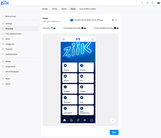
The Home tab is where you configure what appears on your users' home screen.
Image
You can upload a background image that appears at the top of the home screen, behind the tiles. It is scaled and cropped to 1:1, so use a square image for best results.
Colors
You can also set the icon colour, icon background colour, and screen background colour.
Tiles
The homescreen can contain two types of tiles:
- Built in tile — links directly to a built-in Ziik module or an integration (e.g. Handbooks, Checklists, Contacts, Walor Whistleblowing). The icon and label are inherited from the module; to change those, go to Icons & menu names.
- Custom tile — links to any URL. Useful for linking to external tools, internal resources, or specific content in Ziik.
Editing tiles
- Drag and drop tiles to change their order
- Click the edit icon that appears on a tile in the preview to open its settings. From there you can change the size, style and image.
Note: To change the icon or label for tiles that link to Ziik modules, go to the Icons & menu names tab — those settings live there, not in the Home tab.
Add a custom tile
Custom tiles are useful when you want to highlight resources outside the standard module set, such as:
- a coming event
- an important manual chapter
- an external tool
- a landing page for a specific process
Tip: With custom tiles, you can link to resources on your Ziik platform, or external URLs. If you do link to content on your Ziik platform, be aware that the tile will be visible to all users, so only link to content that is shared with all users on your platform.
To create a custom tile, click the + in the bottom right of the preview
When creating a custom link tile, you can set:
- Name — the label shown on the tile (supports multiple translations)
- Icon or image— choose from the icon library by searching keywords, or upload an image to use as tile background
- URL (default) — the default URL the tile will open on all devices
- URL per device — optionally override the URL for desktop, iOS, or Android separately. This is especially useful when linking to native app destinations, mobile-specific pages, or different environments across platforms.
Note: If no device-specific URL is set, the tile uses the default URL. If no default URL is set, the tile will only appear on devices where a URL has been defined.
Icons & menu names
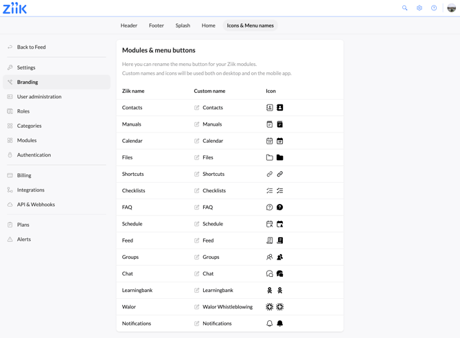
The Icons & menu names tab gives you control over how Ziik's built-in modules are labelled and represented throughout the platform.
For each module you can set:
- Custom name — the label shown to users; supports translations for multilingual workplaces
- Icon — choose a replacement icon from the library
Note: Changes here apply wherever that module appears in the interface, both on web and mobile.